· 7 min read
Which stamping ink to choose? Dye, pigment and distress explained
Does your stamped image vanish on black card or bleed when you add watercolour? It's usually the ink. Here's how to pick the right type for your technique and your paper.
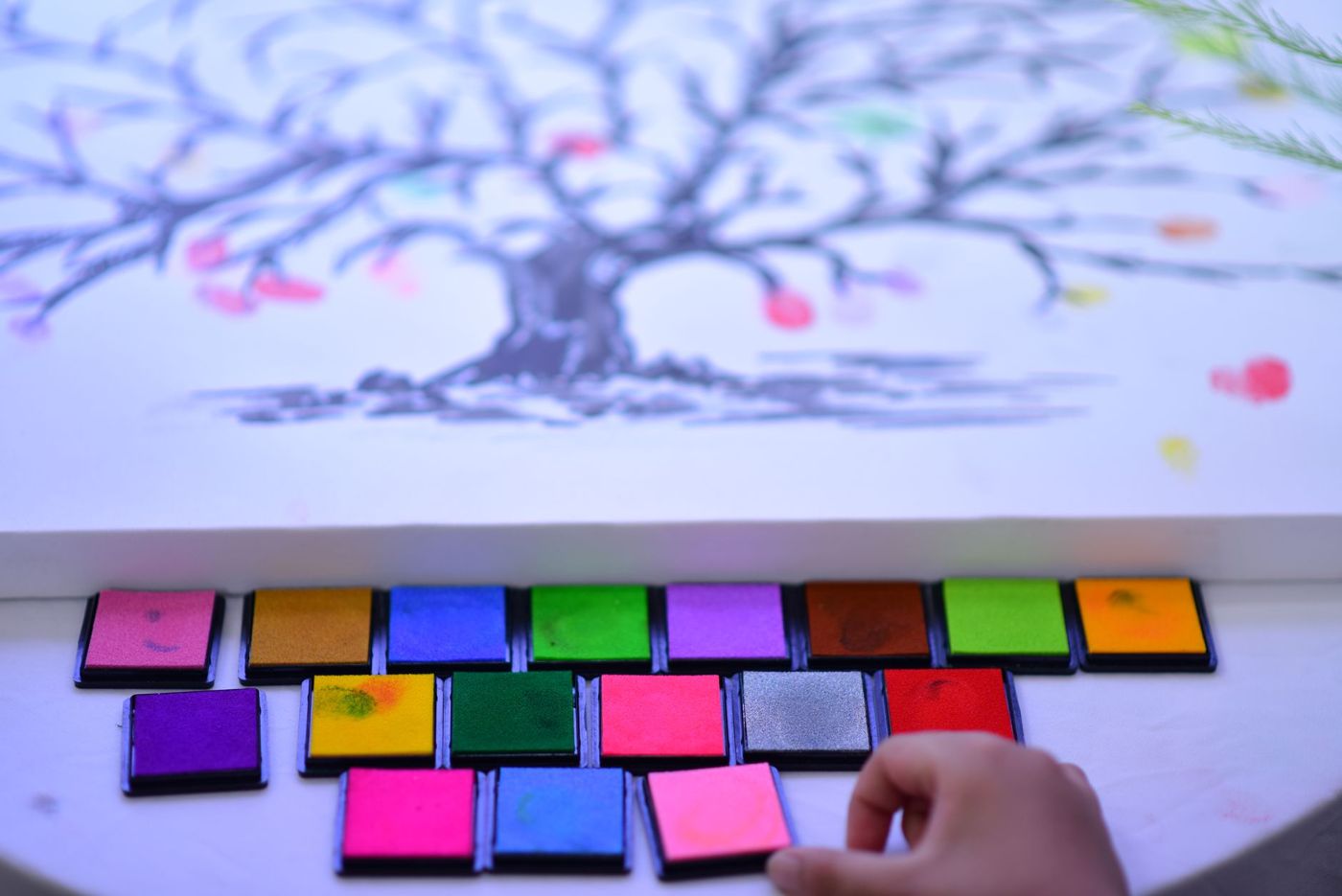
An ink pad seems simple: press the stamp in, press it on the paper, done. Until your image disappears on black card, your lines bleed the moment you colour with watercolour, or a stamp on glossy paper is still wet an hour later. It almost always comes down to the type of ink. Once you know how the main families work, you can choose with more purpose and waste less money.
Dye ink and pigment ink
Dye ink contains dissolved colourant, usually water-based. It soaks into the paper, dries within a few seconds and gives crisp, fine lines. The colour is transparent: stamp two colours over each other and they blend. On dark paper you can barely see it, and in bright light the colours often fade faster than pigment.
Pigment ink contains tiny particles of colour that sit on top of the paper. It's thicker, more opaque and stays visible on black or navy card. It does dry slowly, though. On ordinary cardstock (sturdy, uncoated card) it takes a while, and on coated or glossy paper it sometimes won't dry at all without heat. That slow drying is exactly what makes it handy for embossing.
There are in-between types too. Fast-drying pigment ink, such as VersaFine, combines crisp detail with coverage. Hybrid ink sits between dye and pigment in how it behaves. As a rule of thumb:
- fine lines and working quickly on white or light paper: dye
- dark paper, opaque white and embossing: pigment
- plastic, photos, metal or glass: solvent ink, more on that below
Distress ink and distress oxide
Distress ink is a dye ink from designer Tim Holtz's range, made for blending and for making paper look aged. It reacts to water and blends beautifully. That's why scrappers use it for soft colour gradients, backgrounds and edges, applied with a sponge or a blending tool, a handle with a round foam pad. It's less suited to crisp stamped images, and it disappears on dark paper.
Because it reacts to water, you can play with it a lot. Tap the pad onto a non-stick craft mat, spray on a little water and drag your paper through the puddle. Or flick drops of water onto a coloured tag and let them dry to create lighter spots. Dry each layer with a heat gun before you carry on. If you're working over printed images, print them on a laser printer, because inkjet ink runs as soon as it gets wet.
Distress oxide combines dye and pigment. The ink sits more on the surface of the paper, dries matte and slightly chalky, and blends more easily without streaks. Add water and you get a mottled, oxidised effect: the more water, the stronger it is. Thanks to the pigment, oxide usually stays more visible on dark card and gives a more even stamped image, although coverage varies by colour. You can happily combine both types.
Two tricks for oxide:
- For a soft, powdery blend, dab some ink off your sponge onto your mat first before you start on the paper.
- New clear stamps (see-through photopolymer stamps) sometimes repel oxide, so you only get dots. If washing doesn't help, ink up in a light pigment ink first, wipe most of it off and then ink up in the oxide. The thin layer of pigment gives it something to grip.
Choose distress ink if you love vintage, playing with water and transparent layers. Choose oxide for soft, opaque backgrounds and for kraft or dark paper. You can top up both with a little bottle of refill ink, called a reinker.
Waterproof ink for colouring in
If you want to colour in a stamped image, the line has to stand up to whatever you're colouring with. If you use watercolour, watercolour pencils or a water brush (a brush with water in the handle), use a permanent, waterproof ink, such as Archival Ink or a hybrid black. Let the image dry properly before you add water, or the lines will bleed anyway.
Alcohol markers are a different story, because they can actually dissolve some inks. A dye ink that doesn't react to alcohol, such as Memento, is a popular choice there. Even some waterproof inks smudge if you colour straight over fresh lines with an alcohol marker. Check the packaging to see whether the ink is suitable for alcohol markers, and always test on a scrap of paper first.
If you're stamping in an album next to photos, choose ink sold as acid-free and archival. That applies to text and line art just as much as to backgrounds.
Dark, glossy or kraft paper
On dark paper, dye ink disappears. Use a white or light-coloured pigment pad, oxide, or emboss with white or gold powder. A lovely trick on black: stamp with a clear embossing pad, emboss with clear powder and then colour the design in with a white watercolour pencil. The embossed line keeps the colour neatly inside the shapes.
Glossy paper, photos, acetate and vellum (translucent paper) don't absorb ink. Dye beads up or smears, and pigment stays wet unless you emboss it straight away. That's what solvent ink, such as StazOn, is for. It dries quickly and stays put permanently on almost any surface, from plastic and metal to glass and leather. It does smell, stains your fingers and needs its own stamp cleaner. It isn't meant for fabric.
Kraft paper is brown, and that dulls transparent colours. Light dye ink turns muted or almost disappears. Black and dark brown, on the other hand, look crisp on it, and opaque ink such as white pigment or oxide gives more colour. Distress ink on kraft gives a subtle tone-on-tone effect, which can look beautiful in a vintage book.
Ink for embossing
For heat embossing you need ink that stays wet and tacky for a long time, so the powder sticks. VersaMark is a nearly colourless, slow-drying ink made especially for this. Without powder it gives a subtle watermark on coloured card, just a shade darker than the paper. Ordinary pigment ink works for embossing too.
Sprinkle the powder on straight after stamping, tap off the excess and heat until it melts and turns shiny. With an embossing pen, a pen filled with tacky embossing ink, you can also cover just a small part of a coloured image with clear powder, so the colour underneath gets a glossy shine. You'll find more about the techniques themselves in the article on embossing.
Stamping on fabric
On a cotton tote, a fabric label or a scrap of linen for your page, ordinary paper ink works poorly, and it's gone after one wash. Use a textile ink that's specifically made for fabric, such as VersaCraft. Here's how to go about it:
- Wash and iron the fabric first to get rid of any sizing and creases.
- Choose a smooth fabric such as cotton. Coarse, thick canvas gives a less crisp image.
- Test on a scrap before you start on the real thing.
- Let the image dry completely.
- Heat-set it with an iron, with a cloth in between. Follow the instructions on the pad.
A fabric that will never be washed, such as a ribbon in your book, can also be coloured with distress ink. Dampen the ribbon, tap ink onto a non-stick craft mat, spray it with water and drag the ribbon through it. Natural fibres take the colour well, but it can run again if the ribbon gets wet later.
Your first ink pads
You don't need a complete range of colours. A small set that goes together will take you a long way:
- A black, waterproof pad for text and line art you want to colour in.
- A dark brown pad, or a distress shade such as Vintage Photo, for edges and a weathered look.
- A clear embossing pad, if you want to emboss or stamp tone on tone.
- A white pigment pad, if you often work on dark paper or kraft.
Add two to four colours that go with the paper you already have. Mini pads are handy for trying out a colour first and take up little space, although they're awkward for large areas. If you use a colour a lot, buy the refill ink to go with it.
Close your pads after use so they don't dry out. Stamp with a clean stamp so you don't transfer another colour into the pad. Tap the stamp lightly on the pad rather than pressing hard, place it straight down and lift it straight up. If your image starts looking faded while your stamp is clean, it's time to re-ink.
Questions about this topic
What's the difference between dye ink and pigment ink?
Dye ink soaks into the paper, dries quickly and gives fine lines, but disappears on dark paper. Pigment ink sits on top, covers better and dries more slowly, which is handy on dark paper and for embossing.
Which stamping ink should I use for watercolour colouring?
Use a permanent, waterproof ink and let the image dry properly before you add water. For alcohol markers, choose an ink that doesn't react to them, and test on a scrap of paper first.
Which stamping ink works on black or dark paper?
Dye ink disappears on dark paper. Use a white or light pigment pad, distress oxide, or emboss with white or gold powder.
What's the difference between distress ink and distress oxide?
Distress ink is a dye ink for soft colour blends and vintage edges. Distress oxide combines dye and pigment, dries matte and is more opaque, so it stays more visible on dark card.