· 7 min read
Distress ink and ink blending without blotches
Soft edges, a sheet that looks old, or a sky that fades from pink to purple: with ink, a sponge and a little patience, you can make it yourself.
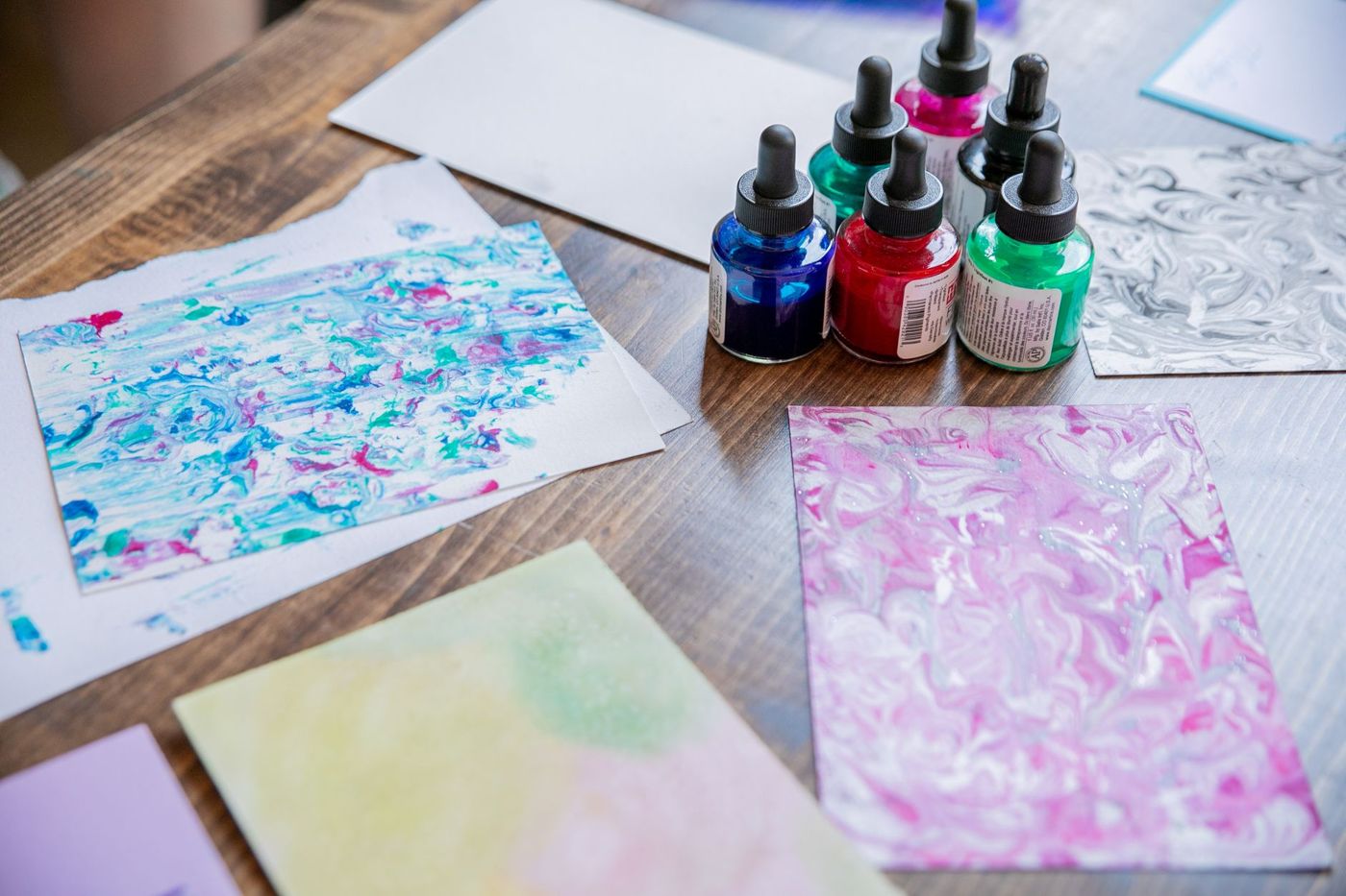
A page of crisp white paper can look a bit bare. Add a little ink along the edge, and suddenly the photo seems as if it has always been in that book. Distressing and blending are two of the most popular techniques in scrapbooks, cards and journals, and they need very little kit. They do take some practice, though, and a few tricks to avoid blotches and streaks.
What is distressing
Distressing literally means making something look damaged. In scrapbooking, it means making your paper look used, weathered or old. You can do that with ink, but also by sanding, tearing, crumpling or roughening the edges.
It suits vintage, shabby chic and grungier styles best, but even on a fresh page a touch of ink along the edge makes a big difference. It adds depth, so layers of paper stand apart from each other, and it softens the hard white cut edge of patterned paper.
Blending is something else: it means applying ink evenly or in a soft gradient across an area, with no visible edges. You use it for backgrounds, skies and blocks of colour. Both techniques need the same tools.
What is distress ink
Distress ink is a water-based stamping ink, originally developed for these techniques. It stays wet longer than many other inks, so colours run into each other on the paper. It also reacts to water: spray it, and the ink starts to move, creating soft blotches and gradients. Stamped images come out a little less sharp than with other inks, and for an old look that is exactly what makes it lovely.
There is also a version that contains pigment, Distress Oxide. It is more opaque, even on coloured paper, and often gives a slightly chalky effect once water is added. The differences between ink types will get an article of their own; this one is about what you do with them. You can blend other water-based inks too, it just often goes less smoothly.
Inking edges and making paper look old
The easiest way to start is by inking the edge of your paper.
- Put your paper on a craft mat or a piece of scrap paper.
- Pick up a little ink on your sponge or blending tool.
- Start off the paper and move towards the edge in small circles, so that only the outer few millimetres take on colour.
- Work slowly a little further inwards if you want a wider edge.
For a rougher look, distress the edges first. There are special distressing tools for this, but scraping the blade of a pair of scissors along the edge a few times does the same job. A nail file or fine sandpaper works too. On paper with a white core you then get pale fibres, and they pick up the ink beautifully. You can tear as well, but tear slowly so you don't lose more than you want.
A few other ways to age paper:
- Crumple the sheet, flatten it halfway and swipe the ink pad straight over it. The creases catch the ink and give dark veins.
- Then spray a little water on the crumpled sheet for drips and blotches. Once it's dry, you can iron it flat between two cloths if you like.
- Sand the surface of patterned paper. Some of the colour comes off and the sheet looks worn.
Try every colour on a bit of white scrap paper first. Ink often looks different on paper than it does in the pad. Keep the pad next to the swatch, so you'll know later which colour was which.
Blending tools: sponge, brush or mini blender
You can blend ink with almost anything soft. The choice mainly depends on how big the area is and how soft you want the result to be.
- A foam blending tool is the classic choice: a handle with a round foam pad that you swap out using hook-and-loop fastening. It's easy to control and works for edges and large areas.
- Blending brushes are round brushes with soft, dense bristles. They give the softest gradient and are very forgiving, because you get almost no hard edges. They are a bit more expensive, though.
- A mini ink blender is a small round tool with a sponge. Handy for small areas, the edges of die cuts and little spots within a stencil.
- A make-up sponge or a rolled-up piece of kitchen roll also works fine to get started.
Use a separate sponge or brush for each colour, or at least keep light and dark colours apart. That way your yellow won't suddenly turn green.
Blending ink without blotches or streaks
Most blotches happen because too much ink lands on the paper in one go. A few habits that make all the difference:
- Tap your sponge lightly on the pad a few times instead of pressing hard. Too little ink is better than too much.
- Always start off the paper, on your craft mat, and then move onto the paper. The first contact releases the most ink, and you don't want that in the middle of your sheet.
- Work in small, light circles. Don't press; let the sponge do the work.
- Build up colour in layers. A second and third pass make it even; one heavy pass leaves blotches.
- Start with the lightest colour and then move to darker ones.
- Hold your paper in place with a bit of masking tape or washi tape on the corners, so it doesn't slide.
If you still spot a smudge, go over it in circles with an empty or nearly empty sponge. That often softens the edge enough.
Which paper blends best
Paper matters at least as much as ink. Smooth, sturdy cardstock with a tight texture gives the nicest gradient: the ink stays on the surface and spreads easily. White or very pale paper shows the colour best.
Soft, absorbent paper, such as thin printer paper or cheap craft card, soaks up the ink straight away. That gives you blotches, and every movement shows. Paper with a rough texture also gives a patchy result, although for an old look that can actually be nice.
For techniques with lots of water, choose watercolour paper. You can use kraft paper and coloured card too, but ordinary ink disappears on them; an opaque pigment ink works better there.
Gradients and multi-colour backgrounds
A gradient with two or three colours looks complicated, but the principle is simple.
- Choose colours that sit next to each other on the colour wheel, such as yellow, orange and red, or blue, green and yellow. Opposite colours like red and green quickly turn brown where they meet.
- Start with the lightest colour and apply it to the part of the sheet where it belongs, going a little past the middle.
- Take the next colour and start from the other side. Work towards the middle and let the colours overlap slightly there.
- Go over the transition once more with the lightest sponge to soften it.
A few variations worth trying:
- Mask part of your sheet with a sticky note or a cut-out shape and blend over it. When you peel it off, you have a crisp white silhouette, such as a tree or a mountain ridge.
- Press a few ink pads onto a craft mat, spray them with water until it beads, and drag your paper through it a few times. Let it dry between layers, with a heat tool (a hot-air gun for crafting) or simply with patience.
- Blend first, then flick some water onto the sheet. Light spots appear where the drops land.
- Stamp a design with embossing ink, sprinkle clear or white embossing powder over it and heat it. Then blend over it and wipe the raised parts clean with a damp cloth. The ink won't stick to the embossing, so your design stays light.
- Blend through a stencil for a pattern that fades softly into the background.
Make a habit of using scraps of paper as test sheets. A few failed gradients are still perfect later for tags, journaling cards or for cutting letters out of.
Good to know
Water-based ink stays damp for a while on some types of paper. Let your work dry properly before you stick or stamp anything on it. If you want to go over it with water or a wet brush later, stamp your outlines in waterproof ink, or the lines will bleed.
Above all: your first sheets will often be blotchy. That's part of it. After an afternoon of practice, you'll get a feel for how much ink you need and how light your touch can be.
Questions about this topic
What is distressing in scrapbooking?
Making paper look used, weathered or old. You can do that with ink, but also by sanding, tearing, crumpling or roughening the edges.
How do you blend ink without blotches or streaks?
Tap your sponge lightly on the ink pad, start off the paper and work in small, light circles. Build up the colour in layers, because most blotches happen when too much ink lands on the paper in one go.
What is the best paper for ink blending?
Smooth, sturdy cardstock with a tight texture, ideally white or very pale. Soft, absorbent paper, such as thin printer paper, soaks up the ink straight away and gives blotches.
What is the difference between Distress ink and Distress Oxide?
Distress ink is a water-based stamping ink that stays wet for a long time. Distress Oxide also contains pigment, so it is more opaque, even on coloured paper, and often gives a chalky effect once water is added.